icedtea
A Rust library that draws a native desktop window on
iced. Buttons, lists, menus, and the chrome around
them come from icedtea. Your program keeps the data (the notes, the
tasks, the file on disk). Paint follows
Material Design 3 color roles
(m3 module and Tokens::scheme()). Desktop chrome stays
rectangular (M3 shape None).
icedtea::run! opens the window. An ActionTable is the list of
commands you declare once; the toolbar, menus, shortcuts, context
menus, footer hints, and the command palette read that list. A
constructor is a function that draws one control and sends a
message — a note about what the user did. Color, layout, and
chrome are Rust values.
Click focuses a control. Tab walks those targets. A focused list,
tree, slider, or pick owns arrows, Enter, and Space. Escape closes
an open menu, pick, context menu, drawer, or cancel dialog.
run! listens. ActionTable::seed_quit adds ctrl+q. Lists,
tables, and trees virtualize. Markdown, code, and fields select and
copy through one select contract.
Read this book in layers:
- First window is the shortest path: one
Action, a toolbar, Tab into the editor, Save, and Quit. - Architecture is how Boot, tokens, the action table, constructors, keys, layout, and patterns fit. That page is the window contract.
- Keep a task list is the same loop with a list and a SQLite file. The cookbook walks those jobs (save, list and detail, table, palette).
- The reference lists every public constructor. Keys for that constructor sit on its page.
Install has the crate line and host libraries.
Install
icedtea is a Rust library. You add it to a desktop program and call its functions to draw the window. This guide is also at https://indynull.github.io/icedtea/.
You need Rust 1.89 or newer (rustup). icedtea
tracks iced 0.14.
cargo add icedtea
That line is enough for First window. A later job
that keeps tasks in a file also adds rusqlite — see
Keep a task list.
Crate docs · crates.io · source
Host libraries
These are the same libraries iced needs to open a window.
- Linux:
libxkbcommon-devandlibwayland-dev(Debian/Ubuntu names). - macOS: Xcode command-line tools (
xcode-select --install). - Windows: MSVC build tools.
First window
This is the smallest icedtea program: a notes window. icedtea::run!
opens it. One Action named Save sits on the toolbar. ctrl+s or
that row writes the text length into the status line. The notes live
only in memory until you build Keep a task list.
The program is examples/hello.rs
in the repository. cargo run --example hello.
//! First window: Save writes the buffer into the status line.

use icedtea::a11y::{A11y, Role};
use icedtea::action::{Action, ActionTable};
use icedtea::i18n::Direction;
use icedtea::iced::widget::text_editor::Content;
use icedtea::key::{self, KeyContext};
use icedtea::pattern;
use icedtea::shortcut::Shortcut;
use icedtea::theme;
use icedtea::widget;
use icedtea::{Boot, Element, Task};

fn main() -> icedtea::iced::Result {
    icedtea::run!(
        Boot::new("Notes", "dev.example.hello").focus(A11y::new("notes", Role::TextBox).node_id()),
        Hello::new,
        Hello::update,
        Hello::view,
        Hello::theme,
    )
}

struct Hello {
    doc: Content,
    status: String,
    table: ActionTable<Message>,
}

#[derive(Clone)]
enum Message {
    Edit(icedtea::iced::widget::text_editor::Action),
    Save,
    Quit,
    Key(icedtea::iced::keyboard::Event),
}

impl From<icedtea::iced::keyboard::Event> for Message {
    fn from(ev: icedtea::iced::keyboard::Event) -> Self {
        Self::Key(ev)
    }
}

impl Hello {
    fn new() -> (Self, Task<Message>) {
        let mut table = ActionTable::new();
        table.insert(
            Action::new("file.save", "Save", Message::Save)
                .with_shortcut(Shortcut::parse("ctrl+s").unwrap()),
        );
        table.seed_quit(Message::Quit);
        (
            Self {
                doc: Content::with_text("Notes"),
                status: "Ready".into(),
                table,
            },
            Task::none(),
        )
    }

    fn update(&mut self, message: Message) -> Task<Message> {
        match message {
            Message::Edit(action) => self.doc.perform(action),
            Message::Save => {
                self.status = format!("Saved ({} chars)", self.doc.text().chars().count());
            }
            Message::Quit => return icedtea::iced::exit(),
            Message::Key(ev) => {
                if let Some(next) = key::handle(KeyContext::default(), &self.table, &ev) {
                    return self.update(next);
                }
            }
        }
        Task::none()
    }

    fn view(&self) -> Element<'_, Message> {
        let tok = theme::named("dark").tokens;
        icedtea::focus::cycle(
            icedtea::iced::widget::column![
                pattern::toolbar(self.table.iter(), tok, Direction::Ltr),
                widget::textarea(
                    &self.doc,
                    Message::Edit,
                    tok,
                    icedtea::layout::FILL,
                    A11y::new("notes", Role::TextBox),
                ),
                pattern::status_bar(&self.status, None, None, &self.table, tok, Direction::Ltr),
            ]
            .spacing(8)
            .padding(12)
            .width(icedtea::layout::FILL)
            .height(icedtea::layout::FILL)
            .into(),
            Some(icedtea::iced::widget::Id::from(
                A11y::new("notes", Role::TextBox).node_id(),
            )),
        )
    }

    fn theme(&self) -> icedtea::iced::Theme {
        theme::iced_theme("dark", theme::named("dark").tokens)
    }
}
Message implements From<keyboard::Event> so run! can subscribe
key::listen. view wraps the column in focus::cycle so Tab
reaches the editor. seed_quit inserts app.quit on ctrl+q.
key::handle matches Save and Quit after the editor owns typing.
Boot is the window name, size, colors, and look (density, type
scale, corners, elevation). run! (and daemon!)
also pick an installed sans face for UI text (normal and bold) and a
fixed face for code. Load a named family on the iced application if
you want a specific font.
A compact tool sets size on Boot (.size(380.0, 560.0).min_size(...))
instead of calling iced window resize. See Compact tools.
When you want the list to survive quitting, go to Keep a task list.
bootstrap(&boot) is the same path without opening a window — use it
in tests. An overlay that hides and pops out uses daemon!
plus Prepared::open.
Crate docs: run!,
Boot.
Architecture
A window is a loop you write in Rust:
- Start it (
Boot,run!). - Color it (
Tokens). - Name the commands (
ActionTable). - Draw controls (constructors return
Elements and send your messages). - Arrange them (patterns and layout).
- Keep the data in your program.
updatechanges that data when a message arrives. A database file, if you have one, is yours — icedtea does not write it.
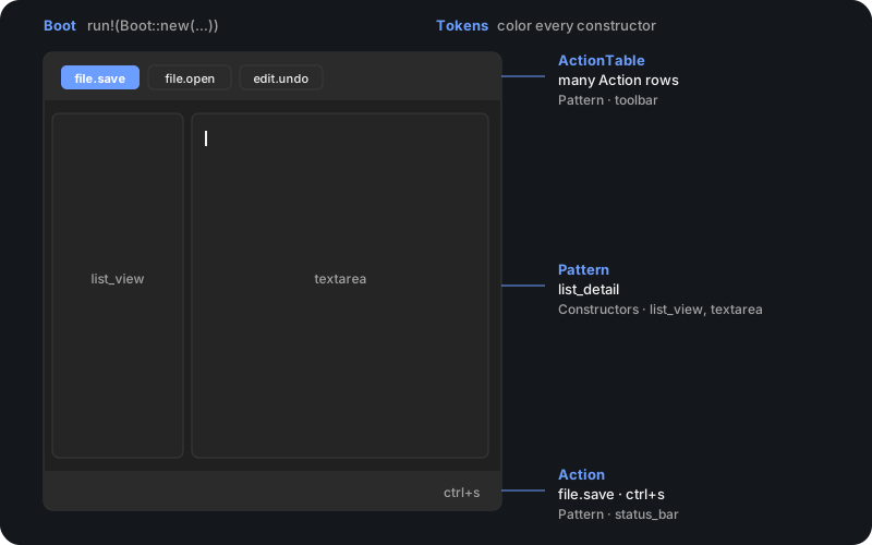
The application owns state and any file on disk. Constructors return
Elements and send messages. One Action is declared once. Paint is
Material Design 3 roles on Tokens (density, type scale, shape,
elevation). Persist follows the host light/dark pair. Chrome rows
take Direction from Boot and mirror. Lists, tables, and trees
virtualize. Select-and-copy is one select contract. Every drawing
constructor takes A11y.
Start the window
Boot
sets title, application id, theme name, locale, density, type scale,
shape, elevation, window kind (application, dialog, or overlay),
transparent buffer, and client decorations.
Catalog::for_locale fills chrome strings for that locale (English,
Vietnamese, Japanese, Chinese, Arabic, Urdu).
run! loads
that and starts iced.
daemon!
uses the same Prepared
settings when the process must stay up with no window mapped.
A desktop shell is that daemon plus Boot knobs and workspace
leaf headers — the same constructors a single-window tool calls.
bootstrap
is that path without opening a window.
Color it
theme::named
and theme::mix
produce Tokens.
Every constructor takes tokens. Persist defaults follow-OS on, so host
chrome layers onto the light / dark desktop pair. A named colorway
is a choice. Register more on ThemeCatalog. See Theming.
Put commands in a table
An ActionTable
holds as many Actions
as you insert. The table is what the menu bar, toolbar, shortcuts,
context menus, footer hints, and command palette read. Each Action is
declared once and carries your message. Write ctrl+s once: Command
on macOS, Control on Linux and Windows. See Actions.
Call constructors
Functions in widget
return iced Elements and emit your messages. Each widget constructor
takes A11y and tokens. Chrome rows take an ActionTable. The
application owns the buffer, the selection, and the rest of the state.
update applies the message. See Accessibility.
Move it
The application owns iced::Animation and the clock. Constructors
paint one frame from a 0–1 progress. See Motion.
Arrange with patterns
pattern
lays constructors out: toolbar and status_bar from the action
table, list_detail beside a filling pane, main_window.
layout
is the box recipes: layout::pack, layout::wrap, layout::dock,
layout::split_view, layout::clamp, layout::form. See
Layout.
Keys
An open modal consumes keys first. Otherwise a focused field owns
unmodified typing. Otherwise the focused focus::target owns arrows,
Page, Home, End, Enter, and Space. Tab walks targets (focus::cycle).
run! subscribes key::listen. Application windows call
ActionTable::seed_quit. Open menus, picks, context menus, drawers,
and cancel dialogs close on Escape. menu_bar on_open publishes
that open and close (including a pick) so KeyContext.modal_open
follows the model. item_press primary fires on
release; ListOpts.on_context is the secondary click. Otherwise
key::handle matches the action table. A filling scroll pane
takes arrows without painting a ring. See Actions.
First window is the smallest case of this compose. Keep a task list is the same loop with a list and a SQLite file the application opens and writes. The reference names every public constructor. Crate docs · source.
Accessibility
Drawing constructors in
widget
take A11y:
name, role, value, hint, disabled, checked / selected / toggled,
expanded, live, required, and error. The constructor calls attach
and fills unset fields from its arguments (slider value, field error,
expander open, toast copy).
Chrome rows (toolbar, menu_bar, status_bar, command_bar) take
the action table; the buttons they paint already carry A11y.
dialog_sheet takes caller A11y. Layout recipes such as
layout::pack and layout::wrap do not take A11y.
Empty caption uses the accessible name. A visible caption is left
alone; decorative chrome may pass an empty name. disabled drops
the activate handler and paints the disabled face.
iced 0.14 has no AccessKit slot. attach sets the iced widget id
from role, name, and disabled. A screen reader does not receive
role, value, or hint today.
Keyboard order is the working desktop path. An open modal consumes
keys first. A focused field owns unmodified typing. Otherwise the
focused constructor owns arrows, Enter, and Space. Tab walks
focus::cycle.
A focus::target
ring is 2 dp, inset one density grid step, on one control face.
A list, virtual column, tree, grid, or table is
focus::group:
the selected row or tile owns chrome. The pane does not paint a
second ring around several item faces (WCAG 2.4.7; APG roving
tabindex; Material list focus is on the item).
Otherwise
key::handle
matches the action table. See Architecture.
Material Design 3 foundations
icedtea maps its design system to
Material Design 3.
A dated snapshot of the spec pages used in gallery QA lives in
.grok/skills/gallery-qa/references/material/ (just material-snapshot).
Applying a new number into src/m3 is a human edit after reading that
snapshot.
Color roles
Tokens::scheme() maps short token fields onto m3::Scheme roles.
light and dark are the desktop pair, not the M3 baseline palettes.
Field mapping:
| Tokens field | M3 role |
|---|---|
canvas | surface |
surface | surface_container |
panel | surface_container_high |
text | on_surface |
muted | on_surface_variant |
primary | primary |
accent | secondary |
danger | error |
border | outline |
selection | secondary_container |
selection_text | on_secondary_container |
Full roles (containers, inverse, scrim) are available via
Tokens::scheme(). Success and warning are desktop extensions.
Type
m3::TypeRole implements the M3 type scale (display through label).
UI text still uses platform sans (typo::UI); code uses typo::MONO.
Constructors read sizes through Tokens::type_px so
Tokens::with_font_scale (0.75–1.5) scales body, titles, and code
together.
Shape and elevation
m3::Shape is the full M3 scale (0 / 4 / 8 / 12 / 16 / 28 dp and Full).
Public controls map through m3::Component.
ShapePolicy
on Tokens picks the map:
- Desktop — every family is shape None (0 dp). This is the default.
- Tight / Soft — one corner (4 / 12 dp) on rounded families. Tabs, app bars, banners, and exclusive segments stay flush (0 dp). Checkbox stays extra-small (4 dp) so the box is not a circle.
- Pill — buttons, chips, badges, search, and tracks are full; cards, fields, menus, dialogs, toasts, and tooltips stay boxes (12 dp); tabs, app bars, banners, and exclusive segments stay flush.
- Material — buttons extra-small, chips and badges small (8 dp), toasts and tooltips extra-small (4 dp), cards medium, dialogs and search extra-large (28 dp), tracks full, flush chrome None.
Switch thumbs stay circular via geometry. Tracks use Component::Track.
m3::Elevation uses tonal surface containers plus optional shadow.
Resting heights match the Material table (0 / 1 / 3 / 6 / 8 / 12 dp).
Desktop Level 1 is a visible drop. Elevated buttons raise one level
on hover. ElevationPolicy::Flat
drops the shadow; surfaces stay on their tonal container.
The shape scale is the ten Material steps (0 / 4 / 8 / 12 / 16 / 20 /
28 / 32 / 48 dp) plus Full.
Density
4 dp grid (m3::GRID). Default density: 8 dp space, 12 dp pad, 48 dp
touch target.
Components
Every public catalog id is listed in m3::mapping::MAP with fate
Map (M3 component family), Desktop (desktop chrome in M3
tokens), or Delete (removed; no dual path). Guide and gallery only
host Map and Desktop rows.
Motion
m3::DurationStep and m3::Ease are the M3 duration and easing
tokens. Desktop chrome uses the short and medium steps (50–250 ms).
Tokens::with_reduced_motion(true) collapses every duration to 0 ms.
Constructors take a 0–1 progress; the application owns a
motion::Run for a Job (enter, switch, disclose, attention,
value). Overlay chrome uses motion::overlay. Next/previous
peers use motion::switch (SwitchFace::SharedAxis). Determinate
progress uses motion::value_animation; the linear busy bar uses
motion::progress_run. See Motion.
Control states
m3::ControlState: enabled, disabled, hovered, focused, pressed,
selected, error — matching M3 interactive states.
Actions
An Action carries the application’s message. One definition feeds
menus, toolbars, shortcuts, footer hints, and the command palette.
update decides what happens when that message arrives.
key::handle plus KeyContext is the default path. An open modal
consumes (even if a field is focused). Set KeyContext.modal_open
from menu_bar / drop_menu on_open (true on open, false on
Escape or a pick). Otherwise focused text owns
unmodified typing. Otherwise the focused focus::target owns arrows,
Page, Home, End, Enter, and Space. Wrap the window view with
focus::cycle so Tab walks those targets. run! already listens;
implement From<keyboard::Event> on the application message so
handle still sees Save.
#![allow(unused)]
fn main() {
use icedtea::action::{Action, ActionTable};
use icedtea::key::{handle, KeyContext};
use icedtea::shortcut::Shortcut;

let mut table = ActionTable::new();
table.insert(
    Action::new("file.save", "Save", "saved")
        .with_shortcut(Shortcut::parse("ctrl+s").unwrap()),
);
assert_eq!(table.invoke("file.save"), Some("saved"));
let _ = handle;
let _ = KeyContext::default();
}
Write ctrl+s once. icedtea stores Command on macOS and Control on
Linux and Windows; menus print that host form.
First window is that Save path: the toolbar row and
ctrl+s both send Message::Save.
key::typed and key::press read what the user typed: Shift+8 is
*, not 8. F1-F24 are Press::Function. Control, alt, and logo
chords return None from typed / press so handle still owns
them.
ActionTable::conflicts reports duplicate shortcuts in the same
context. with_sequence plus key::SequenceBuffer is ctrl+k then
g. handle_in takes a keymap context. The palette keeps recent and
favorites. pattern::cheatsheet lists the
table.
Own stack
dispatch / KeyLayer are for an application that builds its own
layer list. Most windows only need key::handle and KeyContext.
pattern::context_menu places the same Action list under the
pointer. The application stores the point and whether the menu is
open. Click-away and Escape close it. Empty-space right-click is
layout::listen_cursor (including when an editor captured the press).
List, table, grid, and tree rows emit ItemClick; secondary on an
already-selected row keeps the selection. Editors enable Cut/Copy
from text_editor::Content::selection.
Subscribe with key::listen and map events into update, as
examples/hello.rs does.
When a text field is focused, plain typing is not matched against the
action table. Modifier chords (ctrl/alt/logo) still are. For
Enter, Escape, and F1–F24 while typing (activate selection, cancel,
function chords), set
KeyContext { text_input_focused: true, ..Default::default() }.chrome_over_input()
so those bare keys match too (key::WhileInput::Chrome).
Layout
Layout is Rust functions that return iced Elements. Recipes live in
icedtea::layout:
pack, wrap, dock, split_view, clamp, form, grid, pad
(equal-fill tiles), overlay_center, plus size policy and
breakpoints.
layout::pack measures each child, then hugs or shares leftover on
one row or column. Pass Slot::hug
and Slot::share.
Pack
places leftover the stretch children do not take: start, end, center,
or between. layout::wrap is the same measurement, then a new line
when the next child does not fit. Do not pass a uniform child width
or the parent width. Window direction puts the first child on the
start edge. Share slots with a min width reflow a tile wall when the
parent crosses a column count.
layout::pad(cells, 4, density.space) shares row width across cells.
Pair it with widget::button and Density::tile() for a
key pad. Scroll a pane with widget::scroll.
Breakpoint::from_width picks the stacked or beside sidebar recipe.
layout::FILL, layout::SHRINK, and layout::fixed(px) are the size
language for boxes and editors. BoxOpts takes width and height. A
fill-height pack gives leftover to Slot::share
children (a caption above a filling textarea).
pattern::list_detail takes the sidebar as that same size.
split_view and list_detail take Direction: the first pane is
left-to-right start (the right edge when the locale is Arabic or Urdu).
use icedtea::layout::{self, Axis, BoxOpts, Slot};

let panes = layout::pack(
    [Slot::share(source), Slot::share(preview)],
    BoxOpts {
        gap: 8.0,
        width: layout::FILL,
        height: layout::FILL,
        ..BoxOpts::new()
    },
    icedtea::i18n::Direction::Ltr,
);
let _ = layout::pack(
    [Slot::hug(caption), Slot::share(editor)],
    BoxOpts {
        axis: Axis::Vertical,
        gap: 4.0,
        padding: 8.0.into(),
        width: layout::FILL,
        height: layout::FILL,
        ..BoxOpts::new()
    },
    icedtea::i18n::Direction::Ltr,
);
let strip = layout::pack(
    [Slot::hug(mark), Slot::share(field), Slot::hug(go)],
    BoxOpts {
        gap: 8.0,
        ..BoxOpts::new()
    },
    icedtea::i18n::Direction::Ltr,
);
let _ = (panes, strip);
#![allow(unused)]
fn main() {
use icedtea::layout::{Breakpoint, SizePolicy, allocate};
let sizes = allocate(100.0, &[SizePolicy::fixed(20.0), SizePolicy::expand(1.0)]);
assert_eq!(sizes[0], 20.0);
let _ = Breakpoint::from_width(800.0);
}Split ratios persist through UiState::set_split. split_view takes
Tokens and paints the 6 px sash as a hairline plus a short centered
handle. The sash grip emits press; while pressed, listen_sash feeds
window-space pointer move and release into SashDrag::apply.
listen_cursor is the same window pointer for a placed context menu.
workspace::DockNode is a nested leaf / split / tab tree with JSON
save and restore, ratio clamps, and move_panel between docks.
pattern::workspace paints that tree with splits, a sash, and tabs.
pattern::drawer is a compact side pane beside content; progress eases the pane width. pattern::tool_panel is title chrome
plus a Dock control. Perspectives are named DockNode
snapshots.
Theming
Styling is Rust: semantic tokens plus mixing rules. Short token fields
map onto Material Design 3 roles (Tokens::scheme() for the full
set). See Material Design 3 foundations.
Aliases: canvas/surface/panel/text/muted/primary/
accent/danger/border/selection.
Tokens::from_aliases
builds a scheme from those fields. Colorways sync containers from
those aliases and recompute solid-fill on_* roles for contrast.
Washes use scheme state layers (hover_fill / pressed_fill). Desktop
control corners are M3 shape None unless
Tokens::with_shape
selects Tight, Soft, Pill, or the Material component map
(see foundations). Tabs, app bars, banners,
and exclusive segments stay flush under every policy.
Type size is the M3 scale times
Tokens::font_scale
(1.0 by default). Shadows follow
Tokens::with_elevation.
Constructors take Tokens. Tokens.density (Compact / Default /
Comfortable) sets control pad (pad), inter-item gap (space), and
container inset. A *Face enum on the same constructor picks the
painted look (RowFace, CardFace, FieldFace, TreeFace).
ControlSize Compact and Comfortable stay per-control overrides;
Default follows window density.
Built-in names are 40 palettes: dark, light, high-contrast, and
community colorways (Solarized, Gruvbox, Catppuccin, Nord, Tokyo Night,
Dracula, Everforest, Kanagawa, Ayu, GitHub, and others).
theme::named
and theme::code_highlight pick UI tokens and the iced highlighter
face together. Catalog paper, accents, and status stay hex. Body and
mute ink are
theme::auto_ink
on the canvas (87% / 60%). A dumped terminal foreground is not body
copy. high-contrast is defined in Rust. Register more on
ThemeCatalog. Boot.theme is a concrete name and defaults to dark.
Boot::transparent asks iced for an ARGB buffer.
Boot::decorations sets the client title bar. light and dark are a
neutral desktop pair. Persist defaults follow_os on, so host chrome
layers onto that pair; pick another catalog name to choose a colorway.
markdown_view paints inline code and links from Tokens::scheme()
(on_surface, surface_container_high, primary). Truncation is
slicing the source before MarkdownDoc::parse.
#![allow(unused)]
fn main() {
let mut cat = icedtea::theme::ThemeCatalog::new();
cat.register("brand", icedtea::theme::named("dark").tokens, true);
let tokens = cat.resolve("brand")
    .with_font_scale(1.125)
    .with_shape(icedtea::m3::ShapePolicy::Material);
let _ = tokens.primary;
}
Persist stores the same fields on
UiState
(density, font_scale, shape, elevation). Restore with
ui.look(tokens). Boot has the same setters so a window starts
on that look.
Chrome labels come from
Catalog::for_locale.
English, Vietnamese, Japanese, Chinese, Arabic, and Urdu are built
in. Direction is
direction_for
on the locale (Arabic and Urdu are right-to-left). Tokens.direction
flips pick-list chevrons, disclosure marks, tree twisties, search
icons, button leading/trailing icons, list slots, and the scroll rail
(end side). Menu and toolbar rows take
that direction and call
order.
Live switch: store a theme name on state and return
icedtea::theme::iced_theme(&name, tokens) from the theme function.
Families are explicit pairs (github → github-dark / github-light,
and the other real couples). A follow-OS preference selects the light
or dark member of one family (default family: light / dark).
High-contrast is its own name. Names without a pair do not follow the
OS. Persist stores theme plus optional family and follow_os
(follow_os defaults on). Mode changes come from iced
(system::theme / theme_changes).
Follow-OS chrome
Persist defaults follow_os on. The desktop pair (light / dark)
follows OS appearance; host colors layer on top. A named colorway is a
choice: set theme to that name, and set follow_os to false to keep
the palette as authored (or pass
OsChrome::empty).
With follow_os true:
- Resolve the family light/dark member from OS appearance (as above).
- Read host chrome via
theme::os_chrome(boot, main thread on macOS) ortheme::listen_os_chrome(live updates when accent or color-scheme changes). - Apply with
theme::apply_os_chrome. EachSomefield overwrites the matching token; the rest of the pair (or chosen colorway) stays. Selection is rebuilt from primary + canvas.
What the host fills (missing fields stay on the colorway):
| Token | macOS | Windows | Linux (portal, Wayland or X11) |
|---|---|---|---|
primary | control accent | system accent | portal accent when published |
canvas | window background (system gray, not paper white) | COLOR_WINDOW | — |
surface | text background (often white in light mode) | button face | — |
panel | control background | button face | — |
text | label | window text | — |
muted | secondary label | gray text | — |
border | separator | button shadow | — |
Success, warning, and danger always stay on the colorway. Decorated windows keep the native title bar. Turn follow-OS off for high-contrast or a fixed brand palette.
#![allow(unused)]
fn main() {
use icedtea::theme::{self, OsChrome};

let base = theme::named("dark").tokens;
// Opt out: colorway only
let pure = theme::apply_os_chrome(base, false, OsChrome::empty());
assert_eq!(pure, base);

// Opt in: layer whatever the host reported
let live = theme::os_chrome();
let tok = theme::apply_os_chrome(base, true, live);
let _ = tok.canvas;
}Motion
Pick a Job.
Hold a Run.
Pass progress into the constructor. The application owns the clock.
Tokens::with_reduced_motion(true) collapses every duration to 0 ms
so progress snaps to the target.
| Job | When to use it | Constructor |
|---|---|---|
Enter | Dialog, menu, sheet, toast, tooltip | overlay |
Switch(FadeThrough) | Tab body, settings group, unrelated destinations | switch |
Switch(SharedAxis) | Next/previous peers (timeline, wizard, list to detail) | switch |
Disclose(Block) | Expander, accordion, tree branch | expand |
Disclose(Inline) | Drawer, folder rail | expand |
Attention(Shake) | Invalid field after a failed check | attention |
Attention(Pulse) | Live or recording mark | attention |
Value | Determinate progress or ring | value_animation |
Enter decelerates in; exit is shorter and accelerates.
Run::lasting holds a custom enter length and keeps that exit ratio
(the gallery duration slider does this). Shared axis
travels 12 dp: incoming uses progress on that slide, leaving uses
1 - progress on the opposite slide. Fade through finishes the
leaving fade before the incoming fade starts.
Drive a constructor
use icedtea::motion::{self, Enter, Job, Slide};

let mut run = motion::run(Job::Enter(Enter::Dialog), false, tok.reduced_motion);
run.go(true, iced::time::Instant::now());
let t = run.progress(iced::time::Instant::now());
let paint = tok.fade(t);
let sheet = motion::overlay(body, t, Slide::End, tok, a11y);
Build overlay and switch children with
Tokens::fade.
For switch, use SwitchFace::incoming_fade / outgoing_fade.
dialog_sheet, side_sheet, command_palette_view, context_menu,
cascade_menu, drawer, expander, accordion_view, and tree_view
take that same 0–1 progress (tree_view as animating: Option<(id, progress)>).
Mix several jobs
Each surface has its own Run. A sheet, an expander, and a progress
value can run together. The subscription fires while any of them
reports is_live (or while toasts still have TTL).
bounce_out
is a curve for a hop that is not a named job. Sample it like
Ease.
See Material Design 3 for the token names. Constructors are listed under Chrome. Progress is under Readout.
Navigation
Keep page identity in application state. NavStack is push / pop /
replace with can_back when depth > 1. view calls
pattern::navigation_view,
which places a sidebar beside content on medium and expanded widths,
and stacks with a back message on compact. navigation_view still
takes that width as an argument.
One resize subscription feeds it. Subscription::map must be
non-capturing; convert the size in update.
#![allow(unused)]
fn main() {
fn window_width((_id, size): (iced::window::Id, iced::Size)) -> u16 {
    size.width as u16
}

fn subscription() -> iced::Subscription<u16> {
    iced::window::resize_events().map(window_width)
}
}
List/detail, tab view, preferences, about, and status page are in
icedtea::pattern
— they return Elements. See Patterns.
Overlay windows
Boot::overlay() prepares an undecorated, always-on-top palette
window. icedtea::run! starts iced’s application builder and ends
when the last window closes. icedtea::daemon! starts iced::daemon
with the same Prepared settings and stays up with no window mapped.
view and theme receive the window id, so an overlay can use a
transparent canvas while a desktop window stays opaque.
Prepared::open maps the overlay; Prepared::open_desktop maps a
decorated pop-out after window::retarget. Quit with iced::exit.
Boot::size(w, h) is the inner size; there is no 720x480 maximum.
Boot::pointer plus
Boot::displays place the window on the display under the pointer.
window::place is pointer-origin (menus). window::place_centered
centers size on that display (else the first). window::place_pinned
clamps onto pin even when the pointer has moved to another screen.
Hide policy (HidePolicy::EscapeOrFocusLoss, and friends) is
evaluated with should_hide(policy, event, in_card). in_card (search
field or result list) suppresses only HideEvent::FocusLoss. Escape
still hides. run! already subscribes key::listen; pass Escape into
should_hide. In-window overlays (context_menu, dialog_sheet with
Cancel, an open drawer) close on Escape themselves. Overlay windows
do not seed app.quit; application windows call
ActionTable::seed_quit.
window::retarget turns overlay settings into a decorated, resizable
application window at Level::Normal (Dock / task switcher). Size and
position stay. The application chooses when to summon, hide, or pop
out.
In-window modals use pattern::dialog_sheet with DialogOpts on a dim backdrop. Native
file dialogs go through icedtea::native_dialog; message, confirm,
color, and font stay in-app (dialog::InAppDialog).
Compact tools
A tool-sized window sets size on Boot. Density, type scale, corners,
and elevation are the same Boot / Tokens fields as a full window.
Tiles use button with ButtonOpts and layout::pad. Large values use
Tokens::display() (M3 Display Small times font_scale) with platform
bold. Keys use key::press so Shift+8 is *.
use icedtea::density::Density;
use icedtea::key::{self, Press};
use icedtea::layout;
use icedtea::widget;
use icedtea::{Boot, Element};

fn main() -> icedtea::iced::Result {
    icedtea::run!(
        Boot::new("Tool", "dev.example.tool")
            .theme("light")
            .size(380.0, 560.0)
            .min_size(360.0, 480.0),
        App::new,
        App::update,
        App::view,
        App::theme,
        App::subscription
    )
}

// In update, from key::listen:
// match key::press(&event) { Some(Press::Character(s)) => ..., Some(Press::Enter) => ... }
// Ctrl+S still goes through key::handle and Action shortcuts.

// In view: large reading with typo::DISPLAY, keypad with layout::pad
// layout::pad(tiles, 4, Density::default().space)
A four-function keypad on layout::pad, a large reading for the value,
and key::press for digits and Shift+8 as * is the compact tool
shape. The application owns the arithmetic. The first window is
examples/hello.rs.
The caption on a tile can be a glyph; the accessible name stays
readable (⌫ on the face, name Backspace).
Field focus
text_input takes an optional iced Id. After the window
shows, focus that field with iced::widget::operation::focus.
Chrome compose
There is no dedicated shell constructor. Compose search,
list_detail, Tabs { closable: false }, and a footer
(status_bar). style::shell uses M3 Component radius (desktop None)
for a flush rectangular card.
#![allow(unused)]
fn main() {
// Pinned tabs
let tabs = icedtea::collection::Tabs::new(["Read", "Write"]);
assert!(!tabs.closable);

// Focus after show
let _ = iced::widget::Id::new("query");
}
Card plus chips
Compose group_box with chips for tags and meta. Exclusive filters
are Tabs or radio.
Secret field
secret_field is a settings row: password_input (mask or reveal)
plus a copy Action. The application owns the copy message
(icedtea::copy_text).
Save a buffer
Save on ctrl+s through the toolbar is the first window.
First window is that program: file.save,
pattern::toolbar, widget::textarea, pattern::status_bar,
key::listen, key::handle, focus::cycle, and
ActionTable::seed_quit.
An open modal consumes keys first. Otherwise focused text owns
unmodified typing. Otherwise key::handle matches the action table,
so Save still fires while the caret is in the editor. seed_quit
adds Quit on ctrl+q. focus::cycle wraps view so Tab reaches
the editor.
#![allow(unused)]
fn main() {
if let Some(next) = key::handle(KeyContext::default(), &self.table, &ev) {
    return self.update(next);
}
}
Keep a task list is the next job: a list, Add, mark done, and a SQLite file on disk.
Keep a task list
This is a one-day job after First window. You will build a small desktop window that:
- lists your tasks
- lets you type a new one and add it
- lets you mark one done
- remembers them in a real database file on disk (
tasks.db)
icedtea draws the window, the toolbar, the field, the checks, and the status line. You own the list and the file. icedtea does not store your tasks.
The finished program is about 200 lines. The same source lives in the
repository as
examples/tasks.rs.
cargo run --example tasks from a checkout.
What the words mean
A message is a note about something the user did: they typed, they pressed Add, they ticked a box. You invent the notes.
update reads the note and changes your data (and the file).
view looks at the data and draws the window. It does not write
the file.
An Action is a command you declare once. The same Add command
can sit on the toolbar and on ctrl+n.
A constructor is an icedtea function that draws one control and sends your message when the user uses it.
New crate
You need a Rust toolchain (rustup). In an empty folder:
cargo new tasks
cd tasks
cargo add icedtea
cargo add rusqlite --features bundled
bundled means the database engine is compiled with the crate. You
do not install SQLite yourself.
After those two commands, Cargo.toml looks like this. The published
guide fills the crate versions from this repository’s Cargo.toml
when the book builds.
[package]
name = "tasks"
version = "0.1.0"
edition = "2021"

[dependencies]
icedtea = "0.17.2"
rusqlite = { version = "0.32", features = ["bundled"] }
Replace src/main.rs with the program below.
The program
//! Personal task list. Rows live in a SQLite file next to the process.

use icedtea::a11y::{A11y, Role};
use icedtea::action::{Action, ActionTable};
use icedtea::i18n::Direction;
use icedtea::key::{self, KeyContext};
use icedtea::pattern;
use icedtea::shortcut::Shortcut;
use icedtea::theme;
use icedtea::widget;
use icedtea::{Boot, Element, Task};
use rusqlite::Connection;

fn main() -> icedtea::iced::Result {
    icedtea::run!(
        Boot::new("Tasks", "dev.example.tasks"),
        Tasks::new,
        Tasks::update,
        Tasks::view,
        Tasks::theme,
    )
}

struct TaskRow {
    id: i64,
    title: String,
    done: bool,
}

struct Tasks {
    db: Connection,
    rows: Vec<TaskRow>,
    draft: String,
    status: String,
    table: ActionTable<Message>,
}

#[derive(Clone)]
enum Message {
    Draft(String),
    Add,
    Toggle(i64, bool),
    Quit,
    Key(icedtea::iced::keyboard::Event),
}

impl From<icedtea::iced::keyboard::Event> for Message {
    fn from(ev: icedtea::iced::keyboard::Event) -> Self {
        Self::Key(ev)
    }
}

const DB_FILE: &str = "tasks.db";

impl Tasks {
    fn new() -> (Self, Task<Message>) {
        let mut table = ActionTable::new();
        table.insert(
            Action::new("task.add", "Add", Message::Add)
                .with_shortcut(Shortcut::parse("ctrl+n").unwrap()),
        );
        table.seed_quit(Message::Quit);
        let db = open_db(DB_FILE);
        let rows = load_rows(&db);
        let n = rows.len();
        (
            Self {
                db,
                rows,
                draft: String::new(),
                status: format!("{n} tasks · {DB_FILE}"),
                table,
            },
            Task::none(),
        )
    }

    fn update(&mut self, message: Message) -> Task<Message> {
        match message {
            Message::Draft(s) => self.draft = s,
            Message::Add => {
                let title = self.draft.trim().to_string();
                if title.is_empty() {
                    self.status = "Type a task first".into();
                } else if let Err(e) = insert_row(&self.db, &title) {
                    self.status = format!("Could not save: {e}");
                } else {
                    self.draft.clear();
                    self.reload("Added");
                }
            }
            Message::Toggle(id, done) => {
                if let Err(e) = set_done(&self.db, id, done) {
                    self.status = format!("Could not update: {e}");
                } else {
                    self.reload(if done { "Done" } else { "Not done" });
                }
            }
            Message::Quit => return icedtea::iced::exit(),
            Message::Key(ev) => {
                if let Some(next) = key::handle(KeyContext::default(), &self.table, &ev) {
                    return self.update(next);
                }
            }
        }
        Task::none()
    }

    fn reload(&mut self, note: &str) {
        match try_load_rows(&self.db) {
            Ok(rows) => {
                let n = rows.len();
                self.rows = rows;
                self.status = format!("{note} · {n} tasks · {DB_FILE}");
            }
            Err(e) => self.status = format!("Could not read: {e}"),
        }
    }

    fn view(&self) -> Element<'_, Message> {
        let tok = theme::named("dark").tokens;
        let mut list = icedtea::iced::widget::column![].spacing(8);
        if self.rows.is_empty() {
            list = list.push(widget::label(
                "No tasks yet. Type one and press Add.",
                widget::LabelFace::Meta,
                tok,
                A11y::new("empty", Role::Status),
            ));
        } else {
            for row in &self.rows {
                let id = row.id;
                list = list.push(widget::checkbox(
                    row.title.clone(),
                    widget::CheckState::from(row.done),
                    move |s| Message::Toggle(id, matches!(s, widget::CheckState::Checked)),
                    tok,
                    A11y::new(row.title.clone(), Role::Checkbox).with_checked(row.done),
                ));
            }
        }
        icedtea::focus::cycle(
            icedtea::iced::widget::column![
                pattern::toolbar(self.table.iter(), tok, Direction::Ltr),
                widget::text_input(
                    "New task",
                    &self.draft,
                    Message::Draft,
                    Some(Message::Add),
                    widget::FieldOpts::NONE,
                    tok,
                    A11y::new("new-task", Role::TextBox),
                    None,
                ),
                widget::scroll(
                    list.into(),
                    tok,
                    A11y::new("tasks", Role::List),
                    false,
                    None,
                    None::<fn(_) -> Message>,
                ),
                pattern::status_bar(&self.status, None, None, &self.table, tok, Direction::Ltr),
            ]
            .spacing(8)
            .padding(12)
            .width(icedtea::layout::FILL)
            .height(icedtea::layout::FILL)
            .into(),
            None,
        )
    }

    fn theme(&self) -> icedtea::iced::Theme {
        theme::iced_theme("dark", theme::named("dark").tokens)
    }
}

fn open_db(path: &str) -> Connection {
    let db = Connection::open(path).expect("open tasks.db");
    db.execute(
        "CREATE TABLE IF NOT EXISTS task (
            id INTEGER PRIMARY KEY,
            title TEXT NOT NULL,
            done INTEGER NOT NULL DEFAULT 0
        )",
        [],
    )
    .expect("create task table");
    db
}

fn load_rows(db: &Connection) -> Vec<TaskRow> {
    try_load_rows(db).unwrap_or_default()
}

fn try_load_rows(db: &Connection) -> rusqlite::Result<Vec<TaskRow>> {
    let mut stmt = db.prepare("SELECT id, title, done FROM task ORDER BY id")?;
    let rows = stmt.query_map([], |row| {
        Ok(TaskRow {
            id: row.get(0)?,
            title: row.get(1)?,
            done: row.get::<_, i64>(2)? != 0,
        })
    })?;
    rows.collect()
}

fn insert_row(db: &Connection, title: &str) -> rusqlite::Result<()> {
    db.execute("INSERT INTO task (title, done) VALUES (?1, 0)", [title])?;
    Ok(())
}

fn set_done(db: &Connection, id: i64, done: bool) -> rusqlite::Result<()> {
    db.execute(
        "UPDATE task SET done = ?1 WHERE id = ?2",
        rusqlite::params![i64::from(done), id],
    )?;
    Ok(())
}
What each part does
Boot::new("Tasks", "dev.example.tasks") names the window. The second
string is an application id the operating system can use.
open_db creates tasks.db in the folder where you launched the
program, then creates a task table if it is missing. That file is
the database.
load_rows reads every row. insert_row and set_done write. The
window never keeps a second copy that can drift from the file: after
a successful write, reload reads the table again.
Message::Draft is each keystroke in the field. Message::Add is the
toolbar, ctrl+n, or Enter in the field. Message::Toggle is a
checkbox. Empty titles are not saved. seed_quit adds Quit on
ctrl+q. focus::cycle wraps the column so Tab reaches the field
and the list.
scroll lets a long list move. A11y is the name a screen
reader uses; every icedtea constructor takes one.
Run it
cargo run
From this repository instead:
cargo run --example tasks
Type a line, press Add or Enter, tick the box. Quit and run again:
the same rows come back from tasks.db.
If the window does not start on Linux, install the host libraries on Install.
Next
List and detail is the same idea with a sidebar list and a filling pane. The reference names every constructor.
List and detail
A sidebar list beside a filling detail pane. The application owns
which row is selected. The clip owns the list offset. on_scroll
reports start..end for the next view. Jump with scroll_to on
scroll_id. Selecting a row
outside the viewport moves the clip. Change scroll_id when the
row set is a different list. A focused list moves the primary row
with arrows, Page, Home, and End.
#![allow(unused)]
fn main() {
use icedtea::a11y::{A11y, Role};
use icedtea::collection::{ItemClick, Selection, VecList, VisibleWindow};
use icedtea::i18n::Direction;
use icedtea::pattern;
use icedtea::theme;
use icedtea::widget;
use icedtea::{Element, Task};

struct App {
    list: VecList,
    sel: Selection,
    window: VisibleWindow,
}

#[derive(Clone)]
enum Message {
    Select(ItemClick),
    Scroll(VisibleWindow),
    Check(usize),
}

impl App {
    fn update(&mut self, message: Message) -> Task<Message> {
        match message {
            Message::Select(click) => self.sel.apply_item_click(click),
            Message::Scroll(w) => self.window = w,
            Message::Check(_) => {}
        }
        Task::none()
    }

    fn view(&self) -> Element<'_, Message> {
        let tok = theme::named("dark").tokens;
        let side = widget::list_view(
            &self.list,
            &self.sel,
            Message::Select,
            tok,
            widget::ListOpts {
                window: self.window,
                row_h: 32.0,
                overscan: 2,
                on_scroll: Message::Scroll,
                empty: "No rows",
                meta_color: |_| tok.muted,
                scroll_id: None,
                face: icedtea::collection::RowFace::FLUSH,
                on_check: Message::Check,
            },
            A11y::new("files", Role::List),
        );
        let title = self
            .sel
            .primary()
            .and_then(|i| self.list.items.get(i).map(|r| r.title.clone()))
            .unwrap_or_else(|| "Nothing selected".into());
        let detail = widget::label(title, tok, A11y::new("detail", Role::Status));
        pattern::list_detail(
            side,
            detail,
            icedtea::layout::fixed(icedtea::layout::LIST_PANE),
            tok,
        )
    }
}
}
layout::LIST_PANE (360px) sizes the sidebar so a two-line mail title
fits beside a checkbox. The detail child fills. Selection stays on
indices. Pass RowHeights::PerRow when rows are not one height.
RowFace::Card wraps the title on a surface; Flush wraps when the
row is tall enough for two lines, otherwise one clipped line.
Sortable table
A virtualized table. The clip owns the pixel offset. Sort writes
application state. on_scroll reports the mounted range. Jump with
scroll_to on scroll_id. on_h_scroll moves the unfrozen strip.
A focused scroll pane moves with arrows, Page, Home, and End.
#![allow(unused)]
fn main() {
use icedtea::a11y::{A11y, Role};
use icedtea::collection::{ColumnLayout, ItemClick, Selection, TableModel, VisibleWindow};
use icedtea::theme;
use icedtea::widget;
use icedtea::{Element, Task};

struct App {
    table: TableModel,
    cols: ColumnLayout,
    sel: Selection,
    window: VisibleWindow,
}

#[derive(Clone)]
enum Message {
    Cell(ItemClick, usize),
    Sort(usize),
    Scroll(VisibleWindow),
}

impl App {
    fn update(&mut self, message: Message) -> Task<Message> {
        match message {
            Message::Cell(click, _col) => self.sel.apply_item_click(click),
            Message::Sort(col) => self.table.sort(col),
            Message::Scroll(w) => self.window = w,
        }
        Task::none()
    }

    fn view(&self) -> Element<'_, Message> {
        let tok = theme::named("dark").tokens;
        widget::data_table(
            &self.table,
            &self.sel,
            None,
            &self.cols,
            true,
            self.window,
            32.0,
            2,
            Message::Cell,
            Message::Sort,
            Message::Scroll,
            |_| 0.0,
            None,
            |_| (),
            tok,
            A11y::new("files", Role::Table),
        )
    }
}
}
ColumnLayout holds widths, display order, and frozen leading
columns. on_sort and on_h_scroll land in update. on_scroll
stores start..end for the next view. Pass scroll_id when the
application calls scroll_to. Change scroll_id when the row set
is a different table. Selecting a row outside the viewport moves
the clip.
Command palette
The same action table powers the toolbar and the palette. Type to rank; Enter invokes.
#![allow(unused)]
fn main() {
use icedtea::action::ActionTable;
use icedtea::palette::{CommandPalette, PaletteOpts};
use icedtea::pattern;
use icedtea::theme;
use icedtea::{Element, Task};

struct App {
    table: ActionTable<Message>,
    palette: CommandPalette,
}

#[derive(Clone)]
enum Message {
    Query(String),
    Pick(usize),
    Prompt(String),
    Save,
}

impl App {
    fn update(&mut self, message: Message) -> Task<Message> {
        match message {
            Message::Query(q) => self.palette.set_query(&self.table, q),
            Message::Pick(i) => {
                if let Some(next) = self.palette.activate(&self.table, i) {
                    return self.update(next);
                }
            }
            Message::Prompt(s) => {
                if let Some(p) = self.palette.prompt.as_mut() {
                    p.value = s;
                }
            }
            Message::Save => {}
        }
        Task::none()
    }

    fn view(&self) -> Element<'_, Message> {
        let tok = theme::named("dark").tokens;
        let hits = self.palette.results(&self.table);
        let mut opts = PaletteOpts::new();
        opts.page = self.palette.page();
        opts.favorite_count = self.palette.favorite_hit_count();
        pattern::command_palette_view(
            self.palette.query(),
            "Type a command",
            &hits,
            self.palette.selected(),
            Message::Query,
            Message::Pick,
            self.palette.prompt.as_ref(),
            Message::Prompt,
            None,
            1.0,
            opts,
            tok,
        )
    }
}
}
CommandPalette owns the query and the highlight. Empty query lists
favorites, then recent. Type to rank the table. Enter on the field
invokes the highlighted row, or opens a child page when the action
has children. PaletteOpts sets grouping, row face, empty copy
(including omit for a field-only idle), panel size, and highlight.
The query field stays visible when a page or ask parameter is
showing. An overlay window uses Boot with an overlay kind;
window::place_pinned keeps it on a chosen display.
More Material icons
A regular desktop tool uses
Icon
(Save, Folder, Copy, Settings, …) with
icon_svg:
let _ = icedtea::widget::icon_svg(
    icedtea::icon::Icon::Save,
    tok,
    icedtea::a11y::A11y::new("save", icedtea::a11y::Role::Image),
);
A product mark (a logo, a unique toolbar face) is
Glyph::Bytes.
For a Sharp name that is not on Icon, download it, run
adapt_material_svg
once, commit the adapted SVG, and pass Glyph::Bytes. Those two
functions ship in the crate. There is no extra package and no icedtea
command to run.
material_symbol_sharp_url
builds the Sharp FILL 1 URL. star is not on Icon:
https://fonts.gstatic.com/s/i/short-term/release/materialsymbolssharp/star/fill1/24px.svg
$ curl -fsSL -A icedtea \
    "https://fonts.gstatic.com/s/i/short-term/release/materialsymbolssharp/star/fill1/24px.svg" \
    -o star.raw.svg
Run adapt_material_svg on that file and keep the result as
src/icons/star.svg in the application tree. Paint those bytes:
const STAR: &[u8] = include_bytes!("icons/star.svg");
let _ = icedtea::widget::icon_svg(
    icedtea::icon::Glyph::Bytes(STAR),
    tok,
    icedtea::a11y::A11y::new("star", icedtea::a11y::Role::Image),
);
Path data stays Google’s (Apache 2.0; keep a NOTICE line). Names
are Sharp ids (star, arrow_back, draft). Browse
Material Symbols.
Widgets
Drawing constructors in widget return an iced Element and emit
the application’s messages. They take Tokens and A11y (name,
role, value, hint, disabled, checked / selected / toggled, expanded,
live, required, error). Chrome rows take an ActionTable. Layout
recipes do not take A11y. iced 0.14 publishes the widget id only.
Keyboard order is the working path: see
Architecture and
Accessibility. Each constructor below owns the
keys named on its page. The application owns state.
| Group | Page |
|---|---|
| Controls | Controls |
| Fields | Fields |
| Readout | Readout |
| Content | Content |
| Collections | Collections |
| Chrome | Chrome |
| Patterns | Patterns |
Each group page shows a still of the shipped constructors, then names the job, the constructor, and links to rustdoc, source, and crates.io.
Body, code, markdown, and value fields share one
select-and-copy contract
(select).
Controls
Buttons, toggles, and a slider. Faces paint from M3 roles and
ControlState (enabled, disabled, hovered, pressed, selected) via
style and Tokens::scheme().
rustdoc ·
source ·
icedtea ·
iced
Each constructor takes A11y unless noted. iced 0.14 publishes the widget id only.
Button
button — Press a labeled control to send a message.
Constructor: widget::button
title is the face. msg is None when there is nothing to send.
A11y::button(name).with_disabled(true) drops the press handler.
Variant picks the token wash (Primary filled, Quiet tonal,
Outlined, Elevated, Ghost text). Icons is leading and trailing
chrome. ButtonOpts is width and height (SHRINK for a chrome
label, { width: Length::Fill, height } for a pad tile).
Split button
split-button — A primary press plus a more menu.
Constructor: widget::split_button
primary is the main message. more opens the overflow. Disabled
drops both.
Pass A11y.
Toggle button
toggle-button — A button that stays pressed while on.
Constructor: widget::toggle_button
Pass the current on/off state. The message fires on press. Disabled keeps the face and drops the handler. Space and Enter toggle when the button is focused.
Pass A11y.
Checkbox
checkbox — Check, clear, or mark a partial selection.
Constructor: widget::checkbox
The application owns CheckState.
Press follows CheckState::toggle. Disabled keeps the box visible
and ignores clicks. Space and Enter toggle when the box is focused.
Pass A11y.
Radio
radio — Pick one value from a small set.
Constructor: widget::radio
Compare the selected value to this option. Disabled rows stay in the group and do not change the selection. Arrows move the selection when a radio in the group is focused.
Pass A11y.
Switch
switch — A sliding on/off control.
Constructor: widget::switch
Same contract as checkbox: the application owns the bool. Disabled
freezes the thumb.
SwitchOpts::FORM is a settings row (track then caption, Fill).
SwitchOpts::BAR is a toolbar control (caption then track, shrink)
at ControlSize height, next to a compact pick.
Space and Enter toggle when the switch is focused.
Pass A11y.
Slider
slider — Pick a number on a range.
Constructor: widget::slider
Pass min, max, and the current value. SliderMarks paints ticks and
end labels, a vertical rail, and an optional thumb value label. The
message is the new value while the thumb moves. Disabled ignores drag.
Arrows nudge the value when the slider is focused.
Pass A11y.
Segmented button
segmented-button — Exclusive choice among labeled segments.
Constructor: widget::segmented_button
The application owns the selected index. Cells may carry an icon. Press emits the new index. Disabled freezes every segment. ControlSize::Compact is the in-pane exclusive strip. tab_bar stays the pane chrome.
Arrows move the segment. Enter and Space activate it.
Pass A11y.
Button group
button-group — Related actions in one strip.
Constructor: widget::button_group
Each cell is a label plus optional icon (Cell). Press sends the index.
Empty cells paint an empty row. Disabled drops every press. The
outline hugs the cells. Arrows move along the strip. Enter and Space
press the cell.
Pass A11y.
Icon button
icon-button — Icon-only press control for dense toolbars.
Constructor: widget::icon_button
Variant picks the wash. ControlSize is the hit box. Pass a shipped
Icon or Glyph::Bytes. Disabled drops the press.
Pass A11y.
Toggle icon button
toggle-icon-button — Icon button that stays pressed while on.
Constructor: widget::icon_button_toggle
Same wash as toggle button. Disabled keeps the face.
Pass A11y.
Range slider
range-slider — Inclusive low and high values on one range.
Constructor: widget::range_slider
Messages are the clamped pair with low <= high. Disabled freezes both thumbs.
Each thumb is a slider: arrows nudge the focused end.
Pass A11y.
Fields
Text, numbers, dates, and picks. rustdoc · source · icedtea · iced
Each constructor takes A11y unless noted. iced 0.14 publishes the widget id only.
Text input
text-input — A single-line editor.
Constructor: widget::text_input
FieldOpts picks filled or outlined, prefix/suffix icons, a floating
label when the value is non-empty, an optional character count, and
a highlighter: highlight is byte ranges plus a FieldInk role
(text, success, warning, muted, error). error keeps body
ink and draws a danger underline (spelling). The application owns
the matcher (this handbook’s search demo uses SQL); the field paints
those runs on the typed value. Optional iced Id so you can focus
after show. Disabled greys the field and drops edit. Empty value is
a valid state.
Pass A11y.
Password
password — A masked single-line editor.
Constructor: widget::password_input
Characters paint as dots. The application owns the string. Disabled drops edit.
Pass A11y.
Secret field
secret — A settings row: masked field, reveal, and copy.
Constructor: widget::secret_field
Reveal toggles the mask. Copy is an Action whose message the
application handles with icedtea::copy_text.
Pass A11y.
Value field
value-field — A labeled read-only value the user can select and copy.
Constructor: widget::value_field
Meta label in a fixed gutter, selectable value (fill), optional Copy
Action. Pass layout::FORM_LABEL (140px, same as layout::form) so
stacked rows align; pass another width when the stack needs a wider
gutter. Bind the text with field::Selectables (get is Option,
unbound perform is a no-op). Mono face for paths and ids. Same
select-and-copy contract as body and code: app-owned buffer,
select_only, range via Content::selection() and
icedtea::copy_text. See
Content: Select and copy and
select.
Pass A11y.
Text area
textarea — A multi-line editor.
Constructor: widget::textarea
Height is layout::FILL or layout::fixed. The application owns the
text_editor::Content. Disabled drops edit.
Pass A11y.
Search
search — A query field with a search icon.
Constructor: widget::search_input
Use for palette and list filters. Empty query means “show all”.
One Search-radius bar at control height: leading glass, value, and
optional clear sit inside that face. The placeholder is the a11y
name. Pass submit for Enter and an input id when the application
must focus the field. Pass highlight to run a syntax highlighter
on the typed query (FieldRun slices, same roles as FieldOpts).
The application owns the matcher. Pass on_clear for the trailing
clear mark; it paints only when the value is non-empty.
Pass A11y.
Search view
search-view — Docked results under a search field.
Constructor: widget::search_view
The application owns the query and the hit list. Empty hits show
empty. Disabled drops pick and clear.
Arrows move the highlighted hit while the query field is focused.
Pass A11y.
Suggest
suggest — A text field with a pick list of completions.
Constructor: widget::suggest_field
The application owns the query and the suggestion list. Picking a row writes that string.
Pass A11y.
Select
select — Pick one string from a list.
Constructor: widget::pick_list
ControlSize picks the face. Compact uses tight pad and meta type
so a toolbar can nest a dropdown. Default keeps the field body look.
The trailing mark is Material arrow_drop_down: 24 dp (20 dp
Compact), inset Density::inset from the end. A press on the mark
opens the menu. Right-to-left puts the mark on the physical left.
Placeholder shows when nothing is selected. Disabled keeps the
current face.
Enter and Space open the overlay. Arrows move the selection while
the control is focused.
Pass A11y.
Form
form — A labeled field group that owns Tab.
Constructor: widget::form_group
Tab and Shift+Tab walk the rows and wrap. The first text field can
take iced focus on mount when that row is active and carries an
Id. Space activates the focused non-text row. An empty row title
leaves the label column blank. Pick lists, chips, checkboxes,
radios, and segmented buttons sit in the same order.
layout::form only stacks the pairs. The application owns values,
messages, and active.
Pass A11y.
Number
number — Edit a numeric value with step buttons.
Constructor: widget::number_input
The application owns the number. Step messages bump it. Disabled freezes the value. Arrows step the value when the field is focused.
Pass A11y.
Date
date — Pick a calendar date.
Constructor: widget::date_stepper
The application owns the selected day. Disabled ignores picks. Arrows step the day when the control is focused.
Pass A11y.
Time
time — Step hour, minute, second, or period on a 24-hour value.
Constructor: widget::time_picker
TimeValue is hour, minute, second. TimeClock is display only
(12-hour or 24-hour, optional seconds). TimeField is the unit that
steps. Disabled freezes the fields.
Arrows step the focused unit.
Pass A11y.
Field support
field-support — Supporting or error text under a field.
Constructor: widget::field_support
support is quiet helper copy. error uses the error role and wins when both are set.
Pass A11y.
Readout
Progress, sparks, and a large reading. rustdoc · source · icedtea · iced
Each constructor takes A11y unless noted. iced 0.14 publishes the widget id only.
Progress
progress — A determinate bar from 0 to 1.
Constructor: widget::progress
Pass the painted fraction. Interpolate it with
motion::value_animation so the fill eases when the target changes.
Optional buffer is a second fill on the same track.
indeterminate paints a traveling chunk; pass a looping phase
(0..=1) as value. Reduced motion holds that chunk still.
progress_label builds the remaining-time copy. Values outside 0..=1
clamp. No message; it is a readout.
Pass A11y.
Progress ring
progress-ring — A determinate arc from 0 to 1.
Constructor: widget::progress_ring
Same fraction contract as the bar, drawn as a ring. Interpolate
value with motion::value_animation.
Pass A11y.
Spinner
spinner — Eight dots around a circle. Phase lights them in turn.
Constructor: widget::spinner
phase is 0..=1 and comes from application time. Advance it each
frame while work is running.
Pass A11y.
Content
Type, icons, documents, and images. rustdoc · source · icedtea · iced
Each constructor takes A11y unless noted. iced 0.14 publishes the widget id only.
Select and copy
Readable body, code, and markdown share one contract (module
select):
drag a contiguous range of visible text, then host copy (Ctrl+C /
Cmd+C or icedtea::copy_text / icedtea::copy_rich). Typing does
not apply on these surfaces.
| Surface | Who owns the text | Range copy | Select all / full |
|---|---|---|---|
selectable, code | App text_editor::Content via select_only | Content::selection() → copy_text | Action::SelectAll / whole buffer |
markdown | Paint-side document (layout stays real) | MarkdownSpan → copy_rich | markdown_select_all / doc.source |
Labeled values use the same editor path under Fields
and field::Selectables. Chrome (menus, buttons, status meta) is not
drag-selectable. Drag across headings, paragraphs, and lists uses
select::markdown_select and MarkdownSpan::text / html.
Tables copy as the visible cells (tab-separated plain, a <table>
in HTML), the same as selecting rendered markdown in a browser.
Label
label — A line of type.
Constructor: widget::label
LabelFace picks Body, Meta, Display, or Figure. Platform sans.
Empty string is an empty node; still pass A11y.
Icon
icon — A chrome SVG: a shipped Icon or application bytes.
Constructor: widget::icon_svg
Icon is the desktop chrome set (Material Symbols Sharp; see
NOTICE). Pass
Glyph::Bytes
for an app mark (filled black paths). Tokens tint the fill.
material_symbol_sharp_url
and adapt_material_svg
are the crate path for more Sharp marks; see
More Material icons.
Pass A11y.
Tooltip
tooltip — Hover text on a child.
Constructor: widget::tooltip_wrap
TooltipAnchor picks follow-cursor, top, bottom, or start. Empty tip
text is a no-op wrap. The child keeps its own A11y.
Rich tooltip
rich-tooltip — Hover title plus supporting copy.
Constructor: widget::tooltip_rich
Optional action button and TooltipAnchor. Empty title, body, and
action is a no-op wrap. The child keeps its own A11y.
Hyperlink
link — A text link that sends a message.
Constructor: widget::hyperlink
The application opens the URL or navigates. Disabled paints muted text and drops the press.
Pass A11y.
Markdown
markdown — A parsed document.
Constructor: widget::markdown_view
Parse with MarkdownDoc::parse, then view the items. Truncate by
slicing the source before parse. Body is Tokens::body() (M3 Body
Medium times font_scale); H1 is Tokens::page() (same step as a
window title). Links and inline code use
Tokens::scheme() (primary, on_surface, surface_container_high).
Real markdown layout (headings, lists, code frames). Drag a range
with select::markdown_select (X and Y plus the live Tokens so
hit-testing matches the painted scale; a same-line drag is a
range). Consecutive clicks expand the range: word, sentence, then
the block. Pointer events reach markdown_select first so the
painted highlight and Copy are that span. A multi-block range
paints the gap between blocks. Copy is the span only: plain text plus HTML
(copy_rich). Select all is the primary+A chord
(markdown_select_all). The whole source is a separate Copy-all
path (doc.source).
Pass A11y.
Code
code — Source panel. syntax is an iced highlighter token; None is plain monospace.
Constructor: widget::highlighted_code
The application owns the buffer and the language name. Highlighter
face follows the active colorway (theme::code_highlight). Typing
does not change the buffer. Select and copy like selectable.
wrap is word wrap. Pass false so each source line stays one row
(diff hunks, search hits).
Pass A11y.
Image
image — A slot that keeps its box.
Constructor: widget::image_slot
Ready keeps the requested width and height. Missing bytes show the empty slot, not a collapsed layout.
Pass A11y.
Selectable
selectable — Body the user can drag-select and copy.
Constructor: widget::selectable
Looks like body text. The application owns text_editor::Content and
posts Content::selection() with icedtea::copy_text. FontFace::Ui
is prose; FontFace::Mono is a path or raw value. Disabled still
allows select-and-copy.
Pass A11y.
Collections
Lists, tables, trees, tabs, expanders, and pages. rustdoc · source · icedtea · iced
Each constructor takes A11y unless noted. iced 0.14 publishes the widget id only.
The clip owns the list and table pixel offset. The rail and the
wheel write it. on_scroll fires when the mounted range changes or
the scroll arrives at 0 or max. Pass start..end back so view
builds that range. Jump with scroll_to on scroll_id. A new
selection that sits
outside the viewport moves the clip so that row is in view. Change
scroll_id when the row set is a different list (filter, page,
session) so the clip remounts at 0. Variable-height rows use
row_offsets / visible_range_var. scroll_id names the clip
pane on list_view, virtual_column, and data_table.
List
list — A virtualized row list.
Constructor: widget::list_view
Window, row height, overscan, scroll, empty copy, meta color,
scroll_id, face, and on_check sit on ListOpts.
empty is the copy when the model has no rows. Selection stays on
indices. A row press is ItemClick:
shift+primary extends, Command/Ctrl+primary toggles, secondary on a
selected row keeps the selection. Disabled drops row messages. Pass RowHeights::PerRow for variable
row heights (visible_range_var). RowFace::Flush is one clipped
line. RowFace::Card is a surface, wrapped title, and an optional
3px meter. ListModel::leading / trailing paint RowSlot::Icon,
RowSlot::Check, or RowSlot::Text (a small badge; RowSlot::text
is Quiet, or pass a Variant for role ink) on the same
virtualized rows. ListModel::indent insets a row from start.
on_check toggles a check slot.
The list is a focus::group: no Field-radius ring around the pane.
Selected row wash is the item face. A focused list moves the primary row with arrows, Page, Home, and
End. Primary click fires on release. on_context is the secondary
click.
Pass A11y.
Virtual column
virtual-column — Virtualized free-form rows with known heights.
Constructor: widget::virtual_column
The column is a focus::group: no Field-radius ring around the pane.
Same windowing as list (overscan, rail, wheel) for app-built faces —
expand cards, custom bodies. Build heights with
collection::expand_card_heights (closed estimate plus open-row
heights). on_click is the same ItemClick as list_view: primary
on release is select; secondary on press is context. Activate stays
Enter or an application message. Title/meta model lists stay on
list_view.
Pass A11y.
Log
log — Append-only lines that stick to the end.
Constructor: widget::log_view
Virtualizes long logs. Iced’s end anchor reports offset 0, so the log reads the reversed offset and mounts the tail. Empty lines show “No lines”.
Pass A11y.
Item grid
grid — Tiles that share the row width.
Constructor: widget::item_grid
Pass titles. Click sends the index. Empty grid is an empty column.
The grid is a focus::group: no Field-radius ring around the tile
wall. Selected tile is tonal; idle tiles are outlined.
Pass A11y.
Data table
table — A virtualized table. Last column fills.
Constructor: widget::data_table
TableModel holds headers and rows. on_cell is an ItemClick plus
the column.
on_sort is the header click. ColumnLayout order is scroll order;
frozen keeps the first n columns in view. on_h_scroll moves
the rest. scroll_id names the body clip for scroll_to.
TableSource::row_checked plus on_check paint a leading
checkbox column. Empty rows still paint headers.
Pass A11y.
Tree
tree — An expandable outline.
Constructor: widget::tree_view
The application owns expand state. Leaf rows have no twisty. Empty
tree is an empty column. animating is the branch that is opening or
closing and its 0–1 height progress. TreeFace::Outline
is a tight heading tree; titles wrap inside their slot.
TreeFace::Files is an explorer: folder and file marks from dir,
one title line. Both clip the title so a trailing badge stays on the
end. Selected wash covers the full row. Tokens.density scales
pad, gap, and indent. TreeNode::trailing is the same
RowSlot
as list_view; Text is a badge (RowSlot::text is Quiet).
A focused tree expands and collapses with arrows. Up and Down move
the selection.
Pass A11y.
Tabs
tabs — A tab bar over a body the application paints.
Constructor: widget::tab_bar
Tabs { closable: false } is pinned sections. Titles use the meta type
step. with_badge paints a count on a tab. with_icon paints
icon-plus-text. with_disabled
freezes one tab so press is skipped. tab_bar takes
secondary for a 1 dp underbar (3 dp when false). When max_width
is set and titles do not fit, extra enabled tabs move into a More list. Select
sends the index. See also
pattern::tab_view.
A focused bar moves with arrows. Enter and Space activate the
current tab.
Pass A11y.
Accordion
accordion — An open row shows a body under the header.
Constructor: widget::accordion_view
The application owns which row is open and a 0–1 progress for
height. Closed rows are headers only. The chevron sits on the
trailing edge.
A focused accordion moves with arrows. Enter and Space toggle the
open row.
Pass A11y.
Expander
expander — A card that clips its child until the header opens it.
Constructor: widget::expander
The application owns open and progress (0 peek, 1 full). Closed
shows a Peek of the child (pixels, or whole body lines with room
for the last descent) and fades the cut. Title starts; optional
trail sits after the title; the chevron sits on the trailing edge.
Accordion is many headers; this is one card.
Enter and Space toggle the header when the card is focused.
Pass A11y.
Pagination
pagination — Page through a long list.
Constructor: widget::pagination
Pass page count and the current page. Messages are previous, next, and jump. One page hides the control or disables the arrows. Arrows, Page, Home, and End move the page when the control is focused.
Pass A11y.
Chrome
Theme, marks, rows, and feedback. rustdoc · source · icedtea · iced
Widget constructors on this page take A11y. Menu, toolbar, status,
command bar, and cheatsheet take the action table. layout::pack and
layout::wrap do not. iced 0.14 publishes the widget id only.
Colorways
theme::named
looks up a built-in colorway.
source ·
icedtea
Unknown names resolve to dark, the desktop pair with light.
Persist defaults follow-OS on that pair. Register more on
ThemeCatalog. Density, type scale, corners, and elevation live on
Tokens (with_density, with_font_scale, with_shape,
with_elevation) and restore from UiState::look. See
Theming.
Washes
theme::mix
blends two colors for washes.
source ·
icedtea
amount 0 is the background, 1 is the foreground. Hover, pressed,
and selection washes use this.
Shortcuts
key::handle
resolves a key event against the action table.
source ·
icedtea
Subscribe with key::listen.
run! already does. Implement From<keyboard::Event> on the
application message. An open modal consumes. Focused text owns
unmodified typing. Otherwise the focused constructor owns arrows,
Enter, and Space. Tab walks focus::cycle. Otherwise chords match
the table. See Actions and
Architecture.
Cheatsheet
cheatsheet — A searchable shortcut list from the action table.
Constructor: pattern::cheatsheet
Pass A11y. Empty query lists every enabled action. Disabled actions
stay out.
Card
card — A titled panel around children.
Constructor: widget::group_box
Same constructor as group-box. CardFace is elevated, filled,
outlined, or rail (inset start rail and a label gutter). An optional
trailing child sits on the header end. Empty title is a border only.
Pass A11y.
Rule
rule — A horizontal divider.
Constructor: widget::rule_h
rule_v is the vertical twin.
Pass A11y.
Chip
chip — A compact labeled pill.
Constructor: widget::chip
ChipKind is assist, filter, input, or suggestion. Optional icon,
press, and dismiss. META type, chip wash, shrink width. Disabled keeps
the face and drops press.
Pass A11y.
Badge
badge — A count or status mark.
Constructor: widget::badge
BadgeSize is small or large. Both use meta type. Corners follow
Tokens.shape. Pass a host element to overlap the mark on an icon.
Empty string is an empty mark.
Pass A11y.
Pack
pack — Measure children and allocate leftover on one row or column.
Constructor: layout::pack
Pass Slot::hug and Slot::share. Pack places leftover stretch
does not take (start, end, center, between). Empty slots yield an
empty box. Direction mirrors a horizontal box.
Wrap
wrap — Measure children and start a new line when the next does not fit.
Constructor: layout::wrap
Pass slots, gap, and direction. Do not pass a uniform child width or the parent width. Empty slots yield an empty box. Share slots with a min width reflow how many sit on a line.
Banner
banner — A page-level message with an optional action.
Constructor: widget::banner
Use for “offline” or “update available”. Optional button message.
tone paints a callout wash.
Pass A11y.
Command bar
command-bar — The toolbar row, denser.
Constructor: pattern::command_bar
Same Action iterator as toolbar. Disabled actions paint muted.
Context menu
context-menu — Action list under the pointer.
Constructor: pattern::context_menu
Pass A11y. Stack on the window with the click point. Click-away
and Escape dismiss. Rows fill the card. Empty table still paints a
card. progress is 0 (gone) to 1 (rest).
Breadcrumb
breadcrumb — A path of links.
Constructor: widget::breadcrumb
Crumbs before the last send a message. The last crumb is the current page. Empty path is empty. Arrows move along the path when the trail is focused.
Pass A11y.
Menu
menu — An in-window menu bar from one action table.
Constructor: pattern::menu_bar
Groups by the id prefix before . (file.save → File). Disabled
actions stay out of the pick list. on_open publishes true when a
title opens and false on Escape or a pick so
KeyContext.modal_open follows the model.
Toolbar
toolbar — A row of action buttons.
Constructor: pattern::toolbar
First window uses this with file.save.
Direction comes from Boot.
Status bar
status-bar — Footer text plus shortcut hints from the table.
Constructor: pattern::status_bar
Left is status copy (label with LabelFace::Meta, or banner when a tone is set). Right
is each enabled shortcut as two faces (chord in Tokens.text, title
in Tokens.muted at meta size), or an optional caption string. An
empty table shows status only. ActionTable::footer_hints returns
the joined strings (j down) for tests. A click on a hint chord
invokes the same Action.
Scrollbar
scrollbar — A themed scroller with a usable handle.
Constructor: widget::scroll
Lists and tables use a 24px rail. The rail sits on the end side
(Tokens.direction: right in left-to-right, left in right-to-left).
This constructor is the themed
iced scroller for other panes.
A focused pane moves with arrows, Page, Home, and End. It does not
paint a focus ring.
Pass A11y.
Toast
toast — A transient notice.
Constructor: widget::toast_view
The application owns the Toast queue and dismiss. Empty queue
paints nothing. Enter and the last slice of TTL fade through
motion::overlay.
Pass A11y.
Busy overlay
busy — Dim plus spinner over a child.
Constructor: widget::busy_overlay
When busy is false the child is unmodified. Advance spinner
phase while true.
Pass A11y.
Motion
motion — Fade and slide a child for overlay enter/exit.
Constructor: motion::overlay
progress is 0 (gone) to 1 (rest). Hold a motion::Run
for Job::Enter
(dialog, menu, sheet, toast, tooltip). Slide::None is fade only:
build the child with Tokens::fade. Reduced-motion tokens snap to
0 or 1. See Motion.
Pass A11y.
Switch motion
switch-motion — Replace one child with another.
Constructor: motion::switch
SwitchFace::SharedAxis is next/previous peers (timeline j/k):
incoming uses progress on that slide, leaving uses 1 - progress
on the opposite slide, travel is 12 dp. SwitchFace::FadeThrough is
tab bodies and other unrelated destinations. Build each child with
Tokens::fade from incoming_fade / outgoing_fade. Child overlays
(pick lists) still open.
Pass A11y.
Attention motion
attention-motion — Shake or pulse a child.
Constructor: motion::attention
AttentionFace::Shake is an invalid field. AttentionFace::Pulse
is a live mark. Reduced-motion tokens hold rest.
Pass A11y.
Expand motion
expand-motion — Clip a child between a peek size and its open
size on one axis.
Constructor: motion::expand
Axis::Block is height (expander, accordion, tree). Axis::Inline
is width (drawer). progress 0 is the peek; 1 is the laid-out size.
Pass A11y.
Filter chips
filter-chips — Multi-select filter chip set.
Constructor: widget::filter_chips
The application owns which indices are on. Press toggles one chip.
Pass A11y.
Sectioned menu
sectioned-menu — Menu list with optional section titles and dividers.
Constructor: pattern::sectioned_menu
Pass MenuSection groups of actions.
Pass A11y.
Cascade menu
cascade-menu — Two-level menu with an optional open submenu.
Constructor: pattern::cascade_menu
The application owns which primary row is expanded. sub_progress
is 0 (gone) to 1 (rest) for that panel.
Pass A11y.
Patterns
Composed chrome. rustdoc · source · icedtea · iced
Window recipes take children and tokens. nav_rail, tool_panel,
workspace, sectioned_menu, and cascade_menu take A11y. iced
0.14 publishes the widget id only.
Dialogs
dialogs — A confirm / message / save sheet.
Constructor: pattern::dialog_sheet
Pass A11y. Primary accept is required. DialogOpts holds cancel,
extra actions, header icon, and a dim backdrop with 0–1 progress.
Escape sends Cancel when that button is set. Native file dialogs go
through icedtea::native_dialog (an iced Task).
List/detail
list-detail — A sidebar list beside a filling detail pane.
Constructor: pattern::list_detail
Pass A11y. sidebar is layout::fixed or layout::FILL. Children
fill their panes. Pass Direction so the list sits on the start side.
Inspector
inspector — Master, detail, and a side inspector in one row.
Constructor: pattern::inspector
Pass A11y. Three panes. The application owns selection in the list.
Drawer
drawer — A compact-width side pane beside content.
Constructor: pattern::drawer
Pass A11y. open is the committed pane. progress is 0 (gone) to
1 (220 dp). Closed at 0 paints content only. Escape closes an open
drawer when on_close is set.
Workspace
workspace — Nested dock tree: splits, sash, tab groups, leaf chrome.
Constructor: pattern::workspace
DockNode is the layout tree (save, restore, move_panel).
pane is called with each leaf id so every leaf can hold application
content. header is trailing chrome on that leaf (kind badge, close).
Pass |_| None when the leaf has none.
Pass A11y.
Tool panel
tool-panel — Title chrome plus a Dock control.
Constructor: pattern::tool_panel
Title plus body. on_dock is the Dock control. Empty body is title
chrome only.
Pass A11y.
Navigation rail
nav-rail — Compact destination list beside content.
Constructor: pattern::nav_rail
Selected row uses the rail wash. Press emits the destination index.
RailDest carries an optional icon and badge. expanded is the wide
labeled rail; compact shows the icon or the first letter in a 72 px
column. Empty items paint an empty column.
Arrows move the selected destination when the rail is focused.
Pass A11y.
Navigation view
navigation — Sidebar beside content, or a stack with Back.
Constructor: pattern::navigation_view
Pass A11y. NavStack is push / pop / replace. Pass window width.
Breakpoint::from_width picks beside vs stacked. See
Navigation.
Tab view
tab-view — Tabs plus a filling body.
Constructor: pattern::tab_view
Pass A11y. Select and close messages. The application paints the
body for the active tab.
Preferences
preferences — Searchable preference groups.
Constructor: pattern::preferences_page
Pass A11y. PrefGroup is a title plus key/value rows. Empty query
shows every group.
About
about — Name, version, license, and credits.
Constructor: pattern::about_page
Pass A11y. Strings are the application’s. Catalog supplies chrome
labels (Catalog::for_locale: English, Vietnamese, Japanese,
Chinese, Arabic, Urdu).
Status page
status-page — Centered empty or error state.
Constructor: pattern::status_page
Pass A11y. Title, body, and an optional action. Use when a list
has no rows.
Command palette
palette — Fuzzy find over the action table.
Constructor: pattern::command_palette_view
Pass A11y. CommandPalette owns the query and hits. Empty query
shows favorites, then recent. Pass PaletteOpts
for group headings, row face, empty omit, size, and highlight.
A nested page or ask keeps the query field. progress fades and
slides the panel. See Overlay windows.
Main window
main-window — Menu, toolbar, center, and status docked together.
Constructor: pattern::main_window
Pass A11y. Pass the four regions as Elements. First window
is the smaller form: toolbar plus one control.
Side sheet
side-sheet — Docked supporting pane over a dimmed scene.
Constructor: pattern::side_sheet
Pass A11y. end docks the trailing edge. Optional dismiss closes
the sheet. progress fades the scrim and slides the pane.